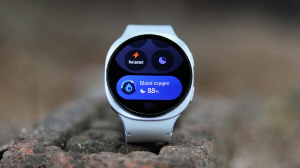
The recent One UI 8 Watch update has left a mixed impression on Galaxy Watch users, particularly due to its redesigned Tiles. Previously, Samsung’s Tiles were praised for their readability and efficient use of the circular watch display. They were easy to navigate and provided key information at a glance, which is essential for smartwatch functionality. However, the new update has introduced Tiles that resemble smartphone widgets, which can be scrolled both horizontally and vertically. While this might sound beneficial, in practice, it has made the Tiles smaller and more complex to interact with, detracting from the straightforward usability that smartwatches require. The Daily Activity Tile, for example, has become less intuitive, with its smaller size and inconsistent design options. The new oblong shape of the Tiles, with visible background colors, contrasts sharply with the previous design that blended seamlessly with the watch’s bezel. This change has been likened to trying to fit oblong shapes into circular spaces, leading to a less cohesive appearance. Additionally, the ability to name Tile screens, while customizable, adds unnecessary complexity. The update’s shift towards widget-like Tiles marks a significant departure from the previous design ethos, and it remains to be seen if users will adapt to or embrace these changes.
Did the One UI 8 Watch update ruin Galaxy Watches?